Curtis Hale
03

Tronic Studio

01

Business Context

The consumer app is what users see. Studio is what makes it sustainable.

Tronic Play delivers gamified brand loyalty experiences to consumers. But a consumer platform serving multiple brands across multiple industries doesn't scale on good design alone — it scales on operational infrastructure. Tronic Studio is that infrastructure: a backend management console that gives brand administrators, agency partners, and the Tronic internal team the ability to configure, launch, monitor, and optimize every element of the Tronic platform independently.

Without Studio, every new brand channel, every new Mission, every incentive update, and every user profile query would require direct developer involvement. With Studio, a brand administrator can configure a fully operational channel — complete with Missions, checkpoints, incentives, and audience gating — in under a few hours.

Stage:

Greenfield product built in parallel with Tronic Play — no legacy workflows, no existing admin patterns, no precedent to reference

Users:

Three distinct user groups sharing one unified interface — Tronic's internal team, brand and client administrators, and agency partners managing accounts on behalf of clients

Strategic role:

Studio is the scalability layer of the entire Tronic platform. It determines how many brands Tronic can serve, how quickly new clients can be onboarded, and how much ongoing support each client requires after launch

Tronic Studio
02

The Alignment Problem

Three user types. One interface. Infinite brand configurations.

The design challenge of Tronic Studio was more complex than it appeared. On the surface, it was a management console. Underneath, it was an interface that needed to serve three meaningfully different users — with different technical sophistication, different daily workflows, and different levels of accountability — without fragmenting into three separate products.

The alignment problems were structural:

Three users, one UI — Tronic's internal operators, client brand administrators, and agency partners all needed to use Studio, but each approached it with different goals, different context, and different levels of platform familiarity. A single interface had to accommodate all three without overwhelming non-technical brand admins or under-serving power users.

Extreme workflow complexity that had to feel simple — creating a Mission involves defining tasks, setting checkpoint sequences, configuring reward types, and building participation gating rules across five possible criteria: points level, membership type, profile traits, token holdings, or point thresholds. The underlying logic is genuinely complex. The interface had to make it feel like a few simple steps.

Permission architecture with an open roadmap — at launch, the platform was in beta and the Tronic team was handling the bulk of admin tasks directly. Multi-tier permissions weren't a day-one requirement — but the architecture needed to be built in a way that could accommodate them as the client base grew and brands took on more direct ownership of their channels.

A reporting system that didn't exist yet — the reporting dashboard was a critical feature for long-term client retention, but was still under construction at launch. It needed to be fully designed and architecturally integrated even before it was live, so that data infrastructure and UI decisions made during build didn't need to be undone when it shipped.

Parallel development with Tronic Play — Studio was designed simultaneously with the consumer app, by the same team. Design decisions made in Play had direct implications for Studio's data model and workflow logic, and vice versa. Keeping both products coherent while moving fast required tight internal alignment at every stage.

Tronic Studio reporting dashboard
Tronic Studio checkpoint type selectionTronic Studio reward vault and incentives
03

Strategic Framework

Apply consumer-grade UX rigor to an admin tool. Don't treat it as an afterthought.

The central strategic decision for Tronic Studio was also the least obvious one: treat the management console with the same UX discipline as the consumer-facing application. Most platforms don't. Admin tools are typically built for function over experience — dense interfaces, assumed technical literacy, minimal onboarding consideration. The result is tools that only internal power users can operate, which creates a permanent dependency on internal support and caps how many clients a platform can realistically serve.

Tronic's business model required something different. For the platform to scale beyond a handful of internally-managed clients, brand administrators and agency partners needed to be able to operate Studio confidently and independently. That meant the interface had to earn their trust through clarity and efficiency — not demand their tolerance through complexity.

Workflow-first design The Studio design process began with workflow mapping, not UI. I documented every administrative task a user would need to perform — Mission creation, checkpoint sequencing, incentive configuration, audience gating, user profile review, reporting — and mapped the logical relationships between them before a single screen was designed. This workflow-first approach ensured that the UI reflected how administrators actually think about their work, not how the underlying data model happened to be structured.

Complexity distillation as the primary UX challenge The Mission creation workflow is the clearest example of the design problem Studio needed to solve. The underlying logic — task definition, checkpoint sequencing, reward type selection, and multi-criteria audience gating across five variables — is genuinely complex. The strategic design decision was to distill that complexity into a linear, step-by-step creation flow that presented one decision at a time, in the order that made logical sense to an administrator, without exposing the relational complexity underneath. The result: a process that feels like a few simple steps while configuring something technically sophisticated.

Permission architecture as a foundation, not a feature At launch, Studio shipped with admin-tier access only — appropriate for a beta environment where Tronic's internal team was operating the platform on behalf of most clients. But the permission architecture was designed with multi-tier access as an explicit future state. The decisions made at launch — data scoping, role-based UI logic, access control patterns — were made with that evolution in mind, so that expanding permissions wouldn't require rebuilding the system that sat on top of them.

Reporting as a retention tool The reporting dashboard was treated as a strategic priority even before it was fully live. Brand administrators who can see Mission completion rates, checkpoint abandonment, incentive claim patterns, and user engagement trends over time are brand administrators who understand the value Tronic is generating — and who renew. The dashboard was fully designed and architecturally integrated during the build phase so that when it shipped, the data infrastructure was already in place.

Tronic Studio checkpoint type selectionTronic Studio contact profile and missions snapshot
Tronic Studio onboarding workflow diagram
04

Creative System

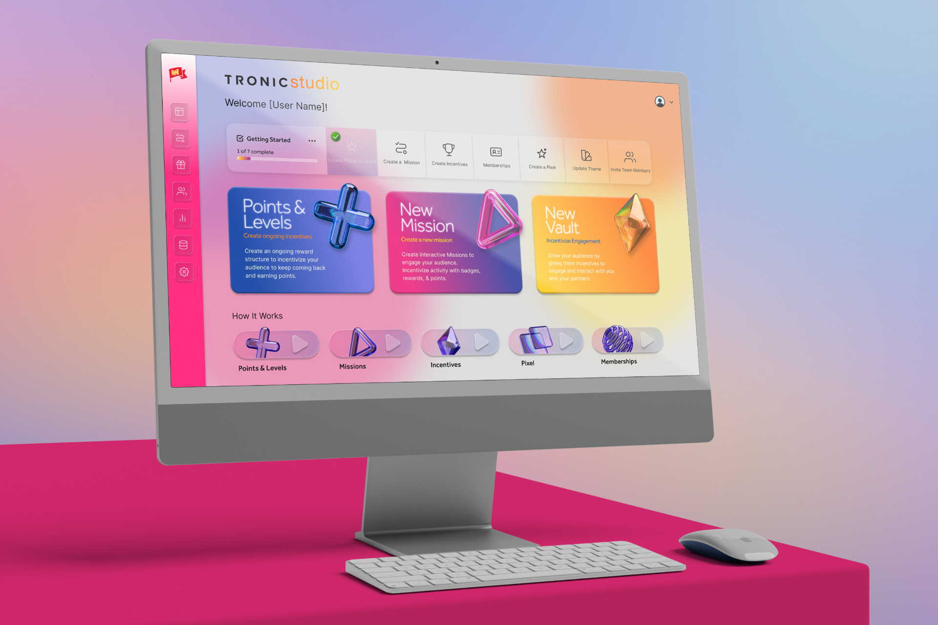
A management console designed for three users, one workflow at a time.

Unified interface architecture 
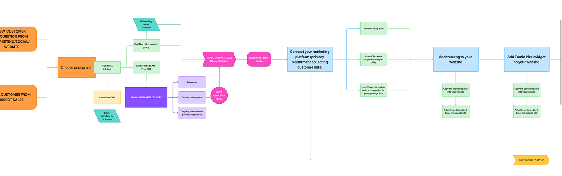
Designed a single interface that serves Tronic's internal team, client administrators, and agency partners — each using the same system with different frequency, different depth, and different primary workflows. Rather than building separate modes or views for each user type, the interface was organized around tasks rather than roles — ensuring that any user, regardless of technical sophistication, could navigate to what they needed without requiring a manual or onboarding session.

Mission creation workflow 
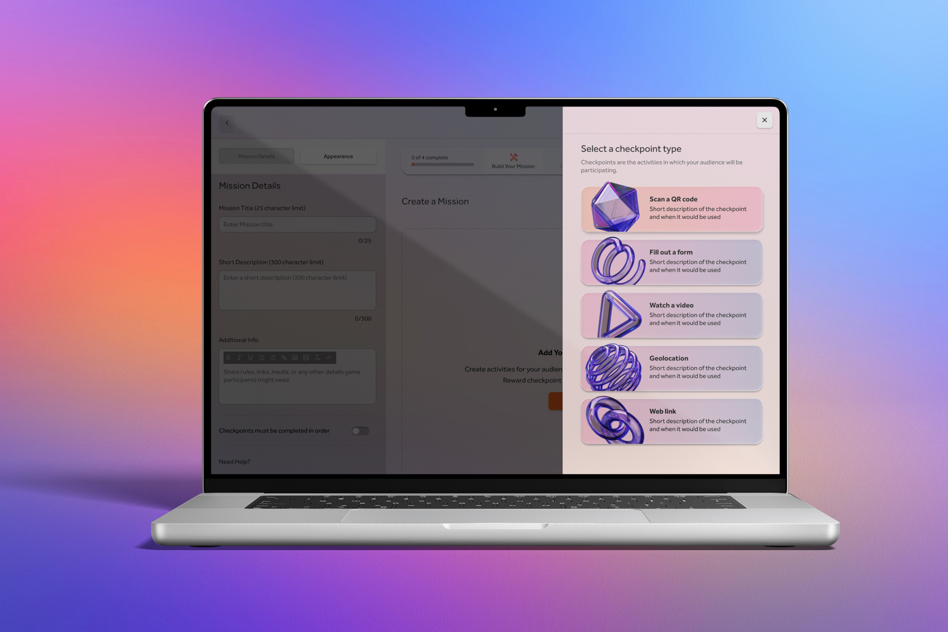
The centerpiece of Studio's UX is the Mission builder — the workflow through which administrators create, configure, and publish the gamified tasks that drive consumer engagement in Tronic Play. The builder distills a multi-variable configuration process into a guided, step-by-step flow: define the Mission, set checkpoints, configure rewards (points, tokens, or reward codes), and define audience participation rules. Participation gating — one of the most powerful and complex features of the platform — allows admins to restrict Mission access by points level, membership type, profile traits, token holdings, or specific token groups. In the interface, this becomes a simple conditional logic builder requiring no technical knowledge to operate.

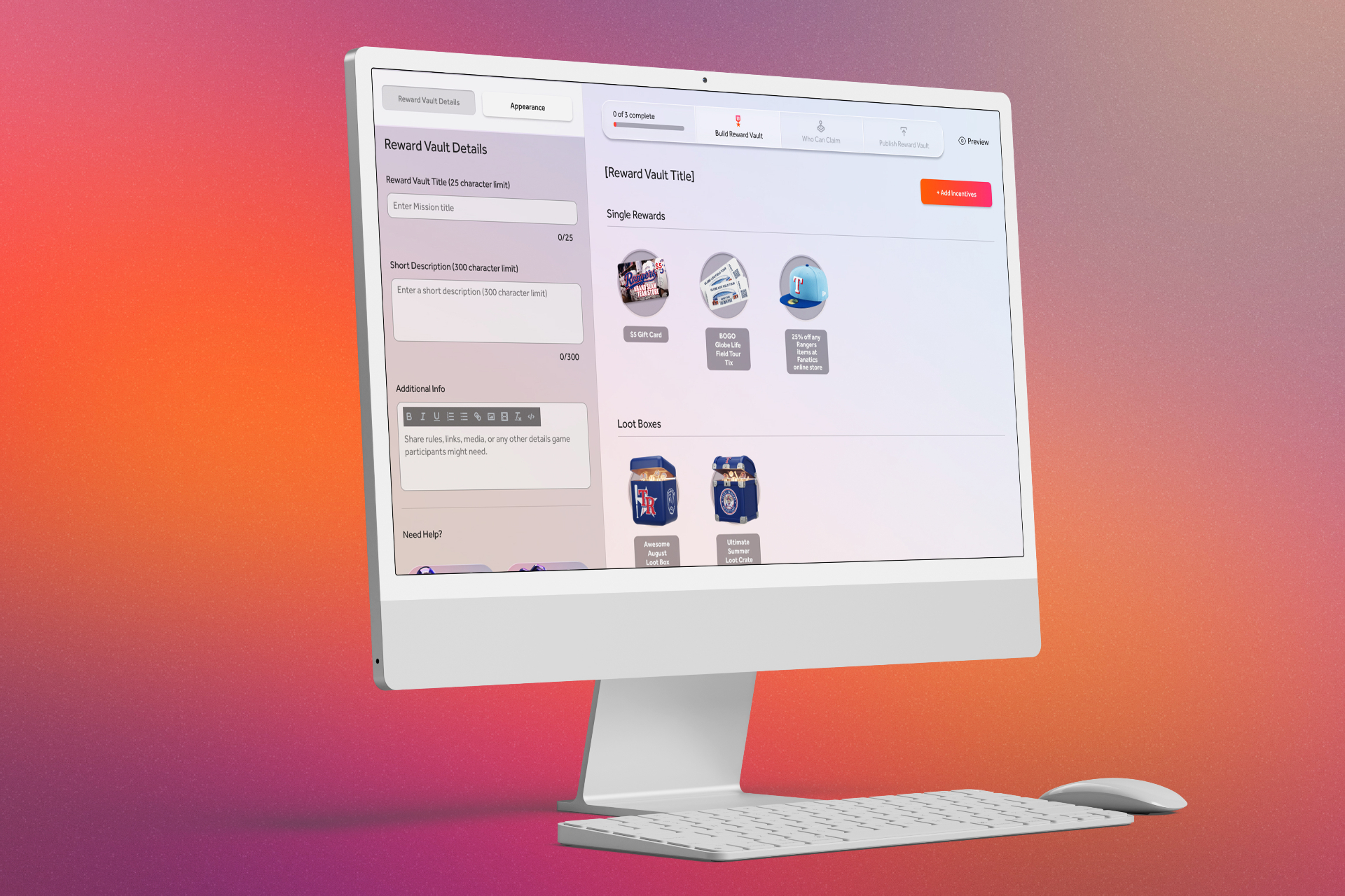
Incentive & reward management Designed the complete incentive management system — covering points level configuration, token creation and distribution logic, and reward management including the ability to upload and manage reward code libraries for distribution upon claim. Each incentive type has its own creation and management workflow, designed to be consistent enough to feel familiar across types while specific enough to surface the controls that matter for each.

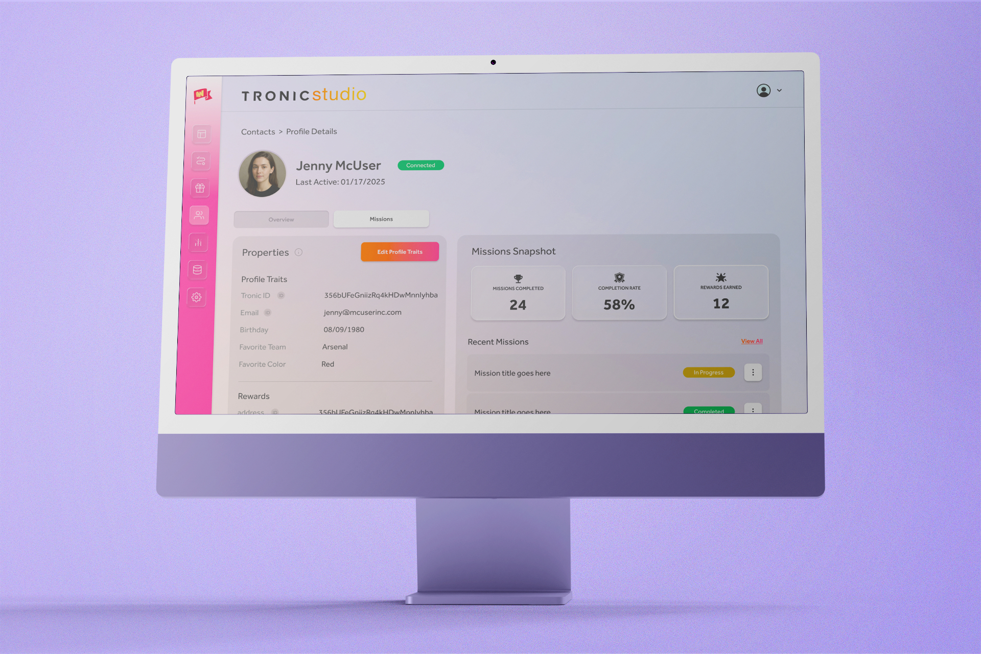
User profile & activity views Administrators can access individual user profiles showing a complete activity snapshot: Missions participated in, completed, and abandoned; incentives claimed; profile properties including user ID and email. This view was designed to serve two distinct use cases — client administrators monitoring engagement quality and Tronic's internal team diagnosing support issues — from the same interface.
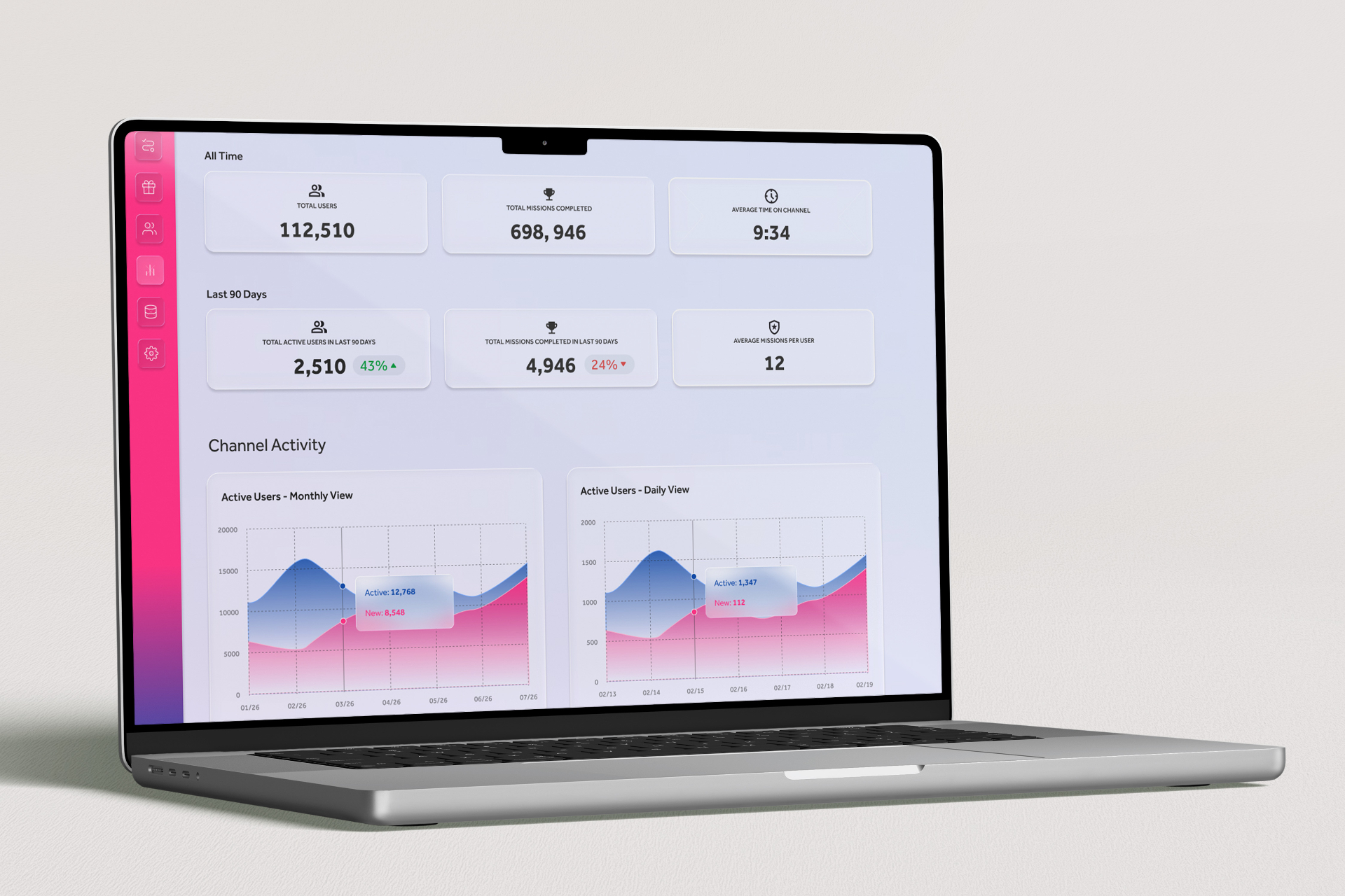
Reporting dashboard Fully designed a comprehensive reporting dashboard — currently in final build — giving administrators visibility into platform performance across every dimension: total users over selectable time periods, Missions completed, average time on channel, Missions completed per user, incentives claimed, and individual performance breakdowns for every Mission, Incentive, and Checkpoint. Email notification open rates are also surfaced in the dashboard, closing the loop between outbound communication and on-platform engagement. The dashboard was architecturally integrated during the Studio build to ensure the data infrastructure was in place before the UI shipped.

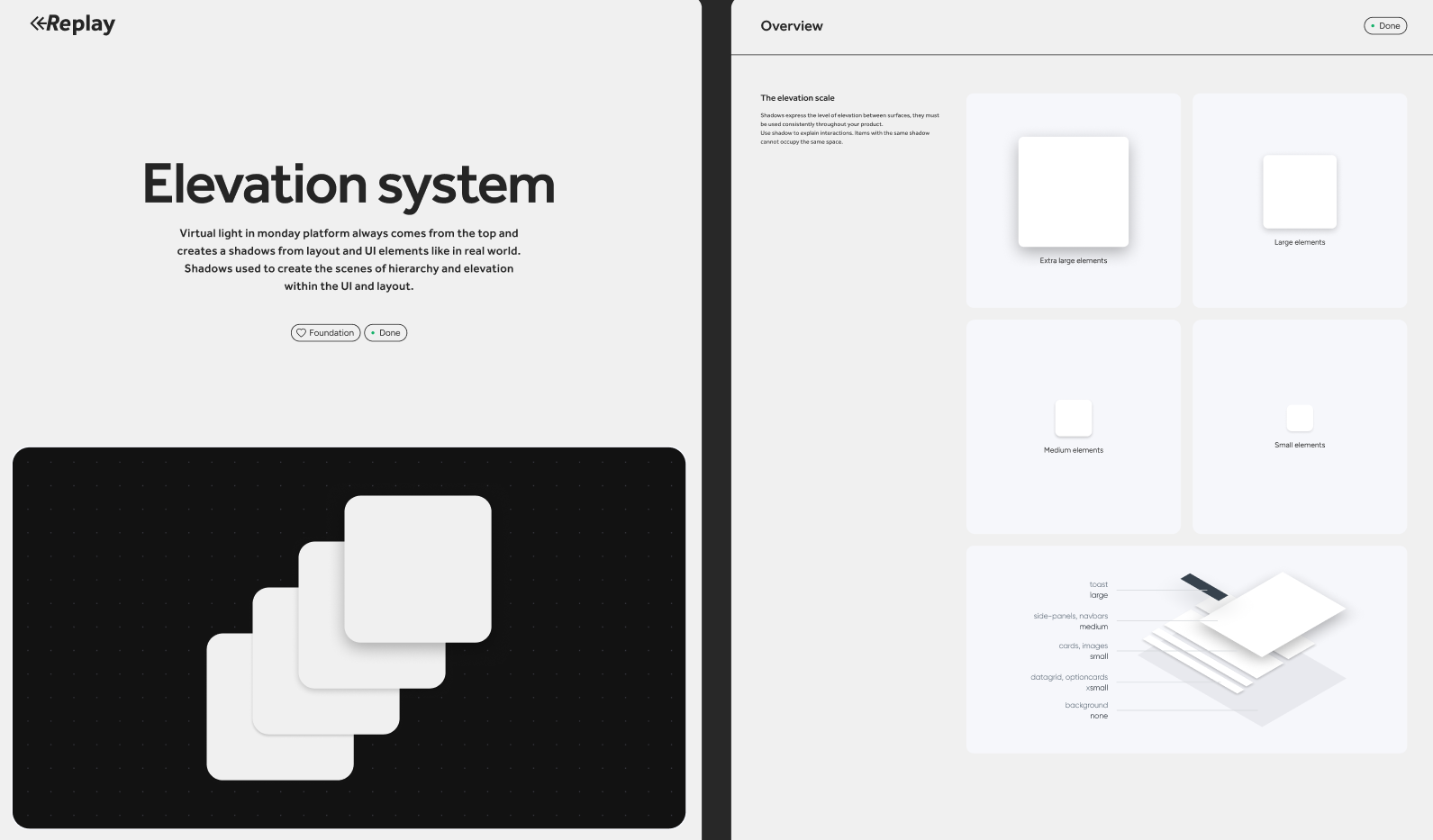
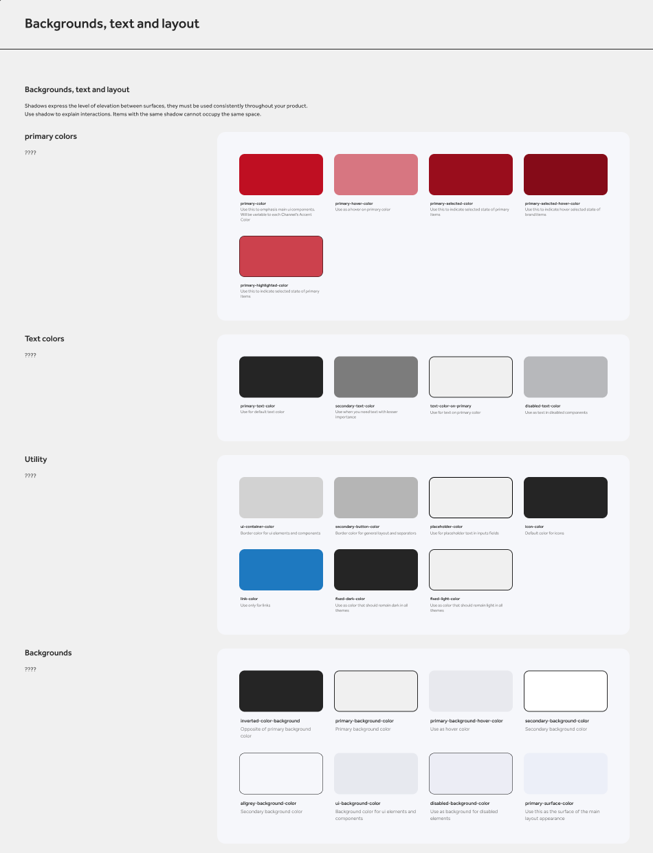
Shared design system with Tronic Play Studio was built on the same component-based design system as Tronic Play — ensuring visual and interaction consistency across both products while accommodating the distinct interface demands of an administrative context. This shared system reduced design and development overhead significantly across the parallel build process.

Replay design system cover
Replay elevation system
Replay typographyReplay typography scale
Replay glass system
Replay color systemReplay backgrounds, text and layout
05

Organizational Impact

A platform that one person can operate. A system that scales.

New brand channel configured in under a few hours A fully operational Tronic brand channel — including Mission creation, incentive configuration, audience gating, and content setup — can be configured by an administrator in under a few hours. That figure is the most direct measure of Studio's design success: the entire complexity of the platform's configuration layer, distilled into a workflow fast enough to be done before lunch.

One beta client operating independently Of the four current beta clients, one is operating Tronic Studio entirely on their own — without Tronic team involvement. That milestone, early in the beta phase, validates the core UX premise: that a non-technical brand administrator can take ownership of the platform without requiring ongoing internal support. As the client base grows, that ratio is the number that determines whether Tronic's internal team scales linearly with client count or stays lean.

Scalability without proportional headcount Before Studio, every configuration change, Mission update, and user inquiry required direct involvement from Tronic's internal team. Studio transfers that operational load to clients and agency partners — meaning Tronic can grow its client roster without growing its support burden proportionally. That's the infrastructure story that makes the consumer platform viable at scale.

Parallel delivery with Tronic Play Studio was designed, prototyped, and built in parallel with Tronic Play — by the same five-person team, on the same timeline. Delivering two coherent, architecturally integrated products simultaneously, without either compromising the other, required a level of internal alignment and design systems discipline that a less structured team would not have maintained under that pace.

Reporting infrastructure built before it was needed By fully designing the reporting dashboard and integrating its data architecture during the Studio build — rather than treating it as a phase two feature — the platform will ship reporting capabilities that are ready to use from day one of general availability. Clients will have immediate visibility into engagement performance, incentive effectiveness, and user behavior from their first full billing cycle. That's a retention decision as much as a product decision.